How this project started
This project was in nobody's plan. It came out of a side observation made during a completely different job.
A year earlier I led the HERE Technologies rebrand with a team of three designers. The work ran from the Intellias side, with HERE as the client. To build a brandbook and a design system you first need to know what they will sit on, so we went through the company's products one by one.
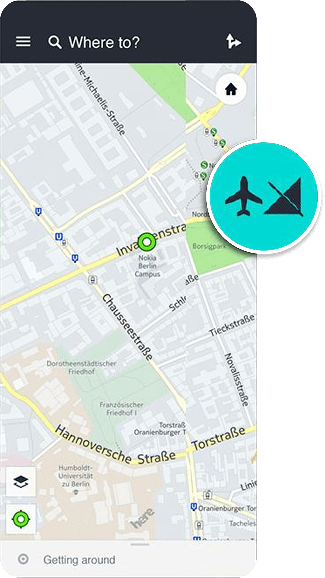
HERE WeGo did not add up. Per the brandbook it was supposed to be one product across several platforms. In practice there were five, and they were different. Five separate products, built over years by different teams at different times under different rules. The same step of a route looked and behaved differently depending on where the user came from.
Formally this was outside my scope. The rebrand was meant to end with a brandbook, not with rebuilding the client's product department.
So I went to my own management at Intellias first, and the argument was commercial. HERE was our largest client, I was already working inside their products, and synchronizing five interfaces was a separate body of work the company could take on. The initiative was approved.
Then I brought the project managers of every HERE WeGo product and the department director into one room. The proposal had two parts. First: the company rebrand was happening anyway, and their department could be the pilot, the first wave of synchronization. Instead of fitting five products to a finished standard later, one at a time, bring them together once.
The second part was about who runs it. The work could be handed to subcontractors, one platform each, and produce the same fragmentation again, this time on top of a new brandbook. I proposed to lead it myself, and the argument was concrete. I already knew HERE products from the inside after the audit, and outside HERE I had automotive interface experience: I worked on the Intellias team that developed MBUX for Mercedes-Benz, where I owned navigation. MBUX was among the projects recognized at the Car HMI Award in Berlin that year. Navigation product experience, knowledge of HERE products, and work at that level settled the question of trust faster than any presentation could.
They agreed almost immediately, and the reason was not the pitch. They saw these divergences every day, and they had accumulated more pain points than I brought into the room. Every new feature required a separate implementation on each platform. The old elements no longer served what the product had to do: there was no 3D mode at all, and the Android Auto and Apple CarPlay updates were live at that moment, adding two more vendor rulesets on top.
After the agreement I hired additional designers into the Intellias team, formed several design teams and led them.
That is where the second phase started. The first phase produced the standard. The second had to move a product made of five different products onto it.
And that is where the thing this case is about showed up. We already had a shared component library. It did not produce a shared experience.
Why the platforms diverged
A component library standardizes appearance. It leaves decisions to the team. That is where the product came apart.
Every button was identical. So were the colors, the type, the spacing, the icons. But the answer to "what does the driver need to see at this step of the route, and when" was given by each team on its own. A library does not ask that question and does not hold the answer to it.
Then history did its work. The five interfaces were built in different years, by different teams, under the priorities of their moment. Web started as a planner, and its logic was the logic of a desk: a lot of information at once, everything within reach, the user seated and unhurried. Mobile grew under movement, and every team that touched it decided on its own what to keep from web and what to drop. The automotive interfaces arrived last and brought foreign rules with them: Android Auto and Apple CarPlay each dictate their own constraints, and the two sets do not match.
So the same step of a route lived in five different scenarios. Speed sat in different places. The next maneuver appeared at a different moment. Search behaved differently on identical queries. A user who planned a trip on the web and then got into a car had to learn the product again each time.
Technical debt accumulated from the same source. The old elements had been built for what the product could do a few years earlier, and they no longer served the new requirements. There was no 3D mode at all, and complex interchanges read poorly on a flat schematic exactly when the cost of an error is highest. Every new feature required a separate implementation on each platform, which meant five times the work for every step forward.
That defined the task of the second phase: reduce five interfaces to one set of decisions. Bringing them to one appearance is something the library could have done on its own.
One logic, three densities
An identical interface across five platforms would have been a mistake. A driver at speed and a person at a desk read a screen in different modes, and what helps one gets in the way of the other.
So what we synchronized was the order of importance: what matters most at this step, what is secondary, what can be hidden. That order stayed the same everywhere. How much information to show at once was decided by the platform.
Web
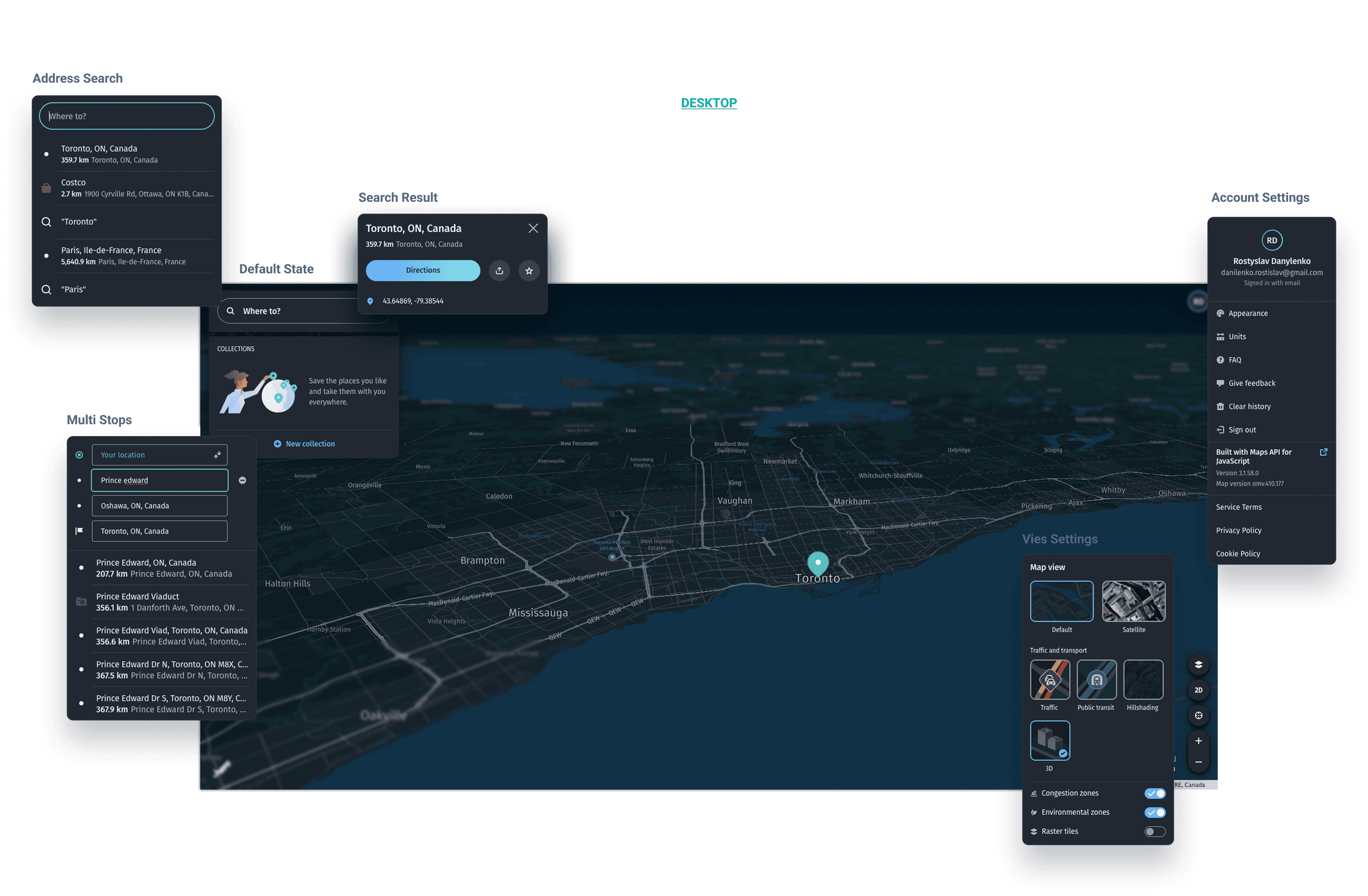
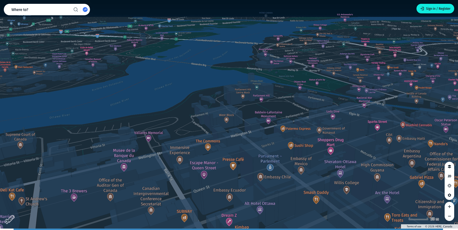
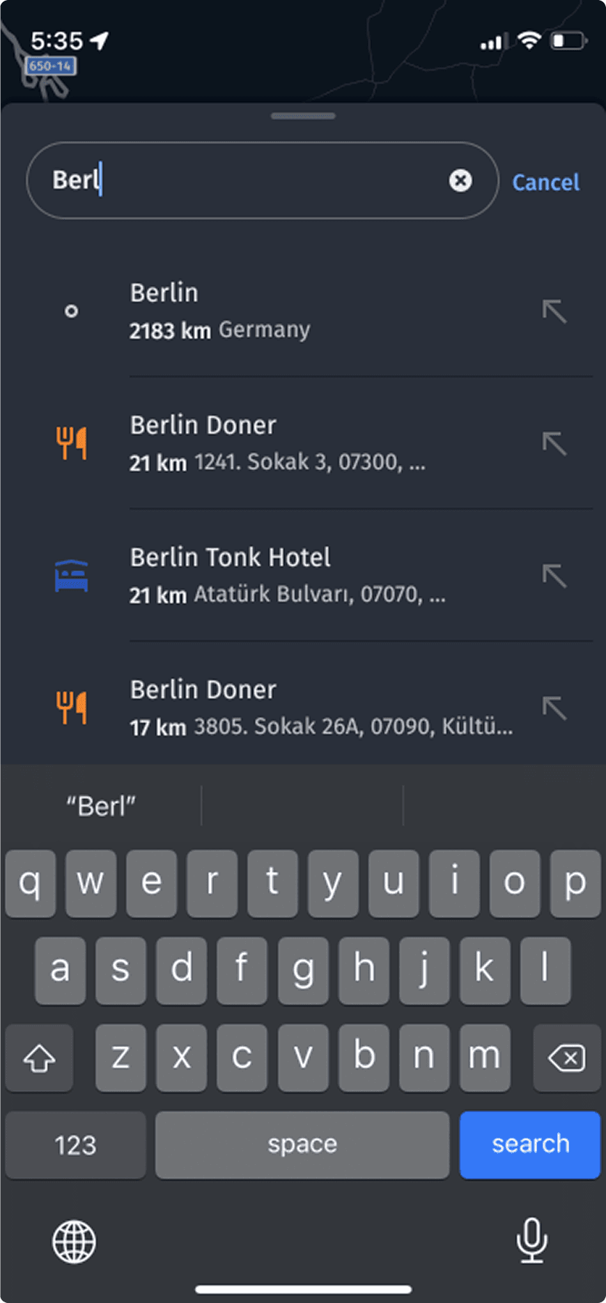
Web got full density. The user is seated, has time and a mouse, and planning a route with several stops belongs here. Multi stop routing was built at this level, together with an expanded POI list where every category received its own colored icon. Color makes the list readable by scanning, without reading the names.
Mobile
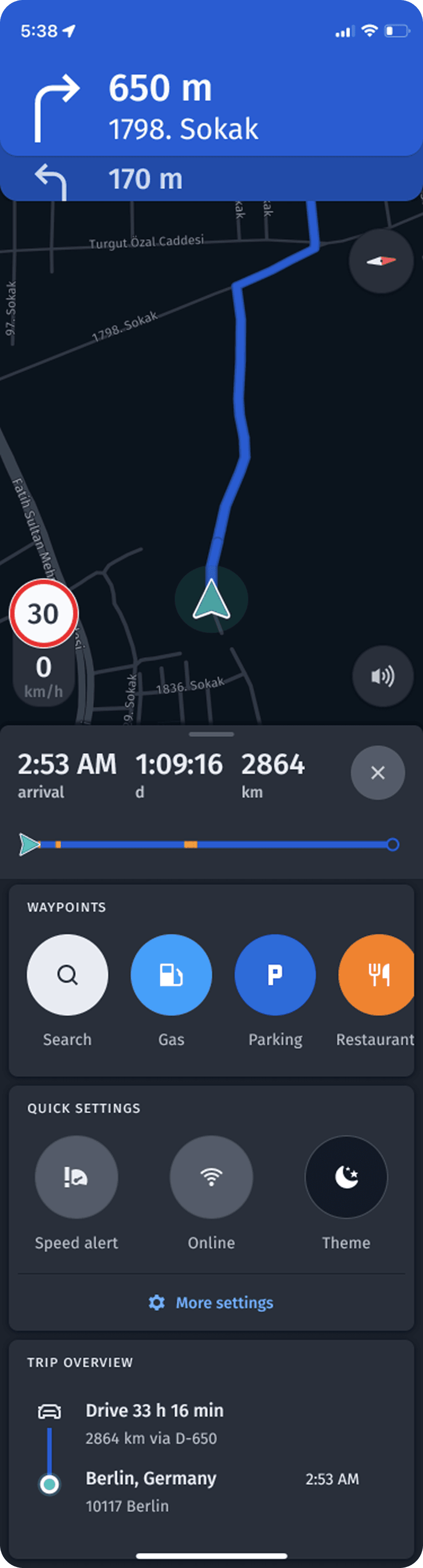
Mobile works one handed and often in motion. Density drops here, and controls move under the thumb. Waypoints and Quick Settings moved inside the navigation window: before that, a user had to leave the route in order to change the route.
New route types landed here as well: cycling, motorcycle and hitchhiking. A movement profile sets different routing priorities, and until then the product had given everyone a single car route with constraints that did not belong to them. No mass market map offered a motorcycle mode in Europe at the time, and none offers one there today. Hitchhiking routing has no equivalent in mass market maps at all.
HMI
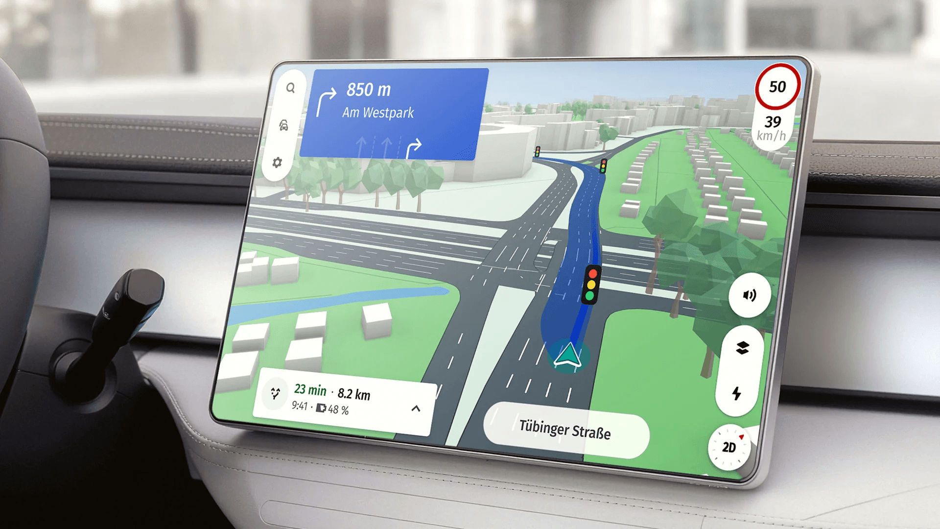
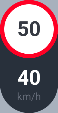
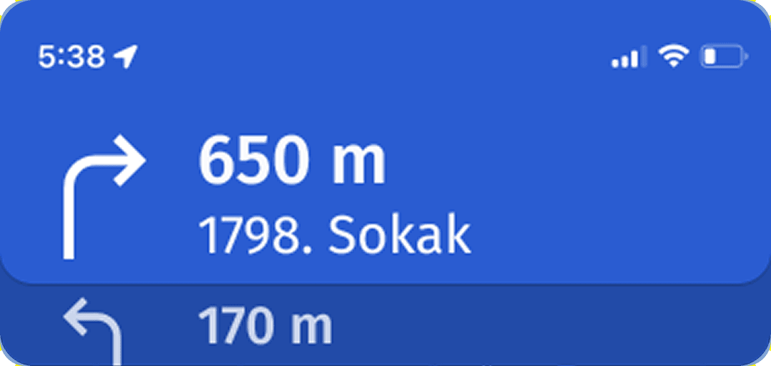
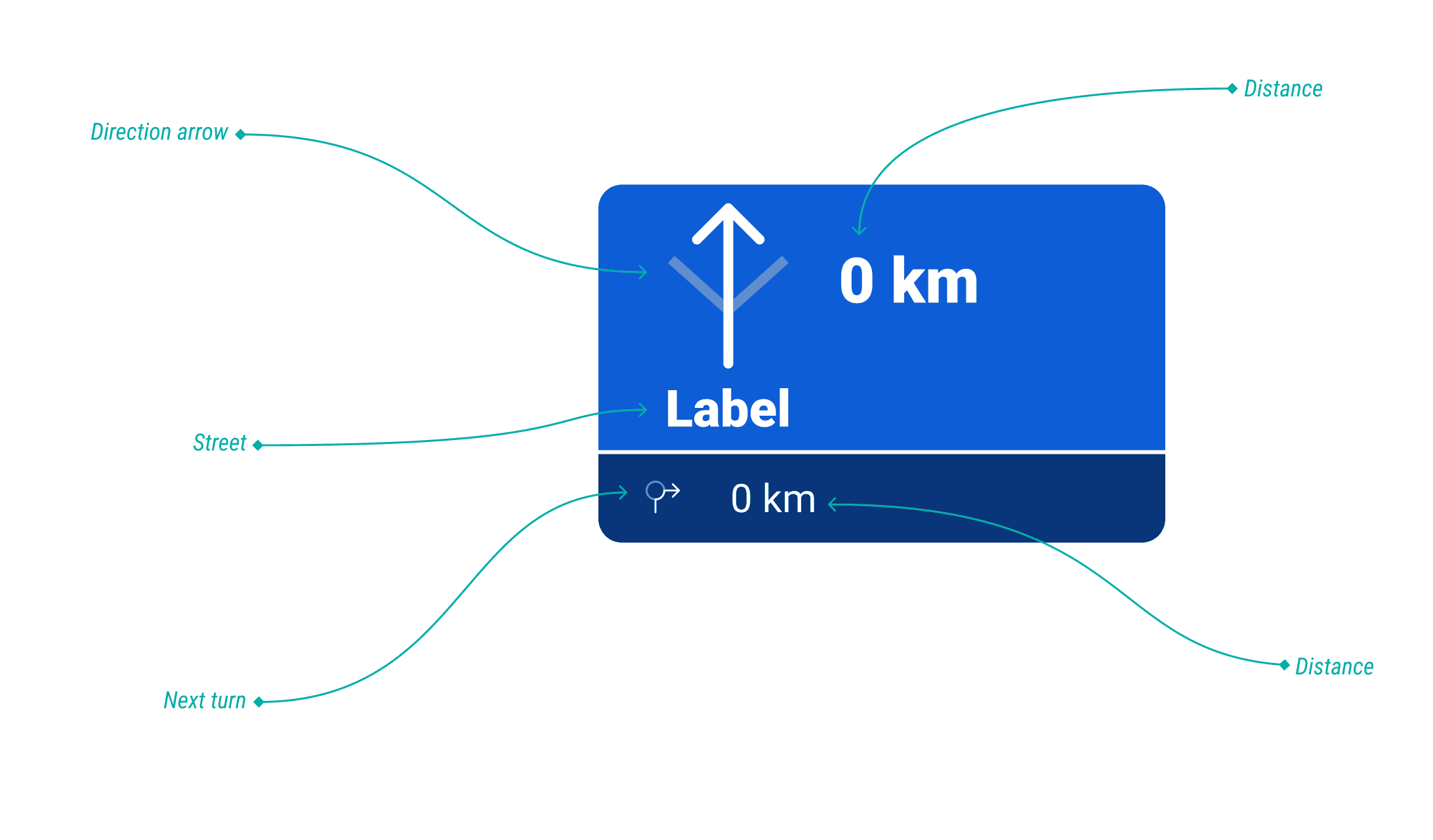
HMI lives under the harshest constraint. The eyes leave the road for a fraction of a second, and in that fraction the screen has to deliver one thing. The speed panel moved to the lower right corner, into the zone the eye catches peripherally without fully leaving the road. Current speed was placed next to the limit, so the comparison happens in one glance instead of two. The direction panel moved to blue with thinner, higher contrast arrows, and a warning for the next maneuver was added in advance rather than at the moment the turn is already there. Touch targets were enlarged: a finger on a steering wheel misses differently than a finger at a desk.
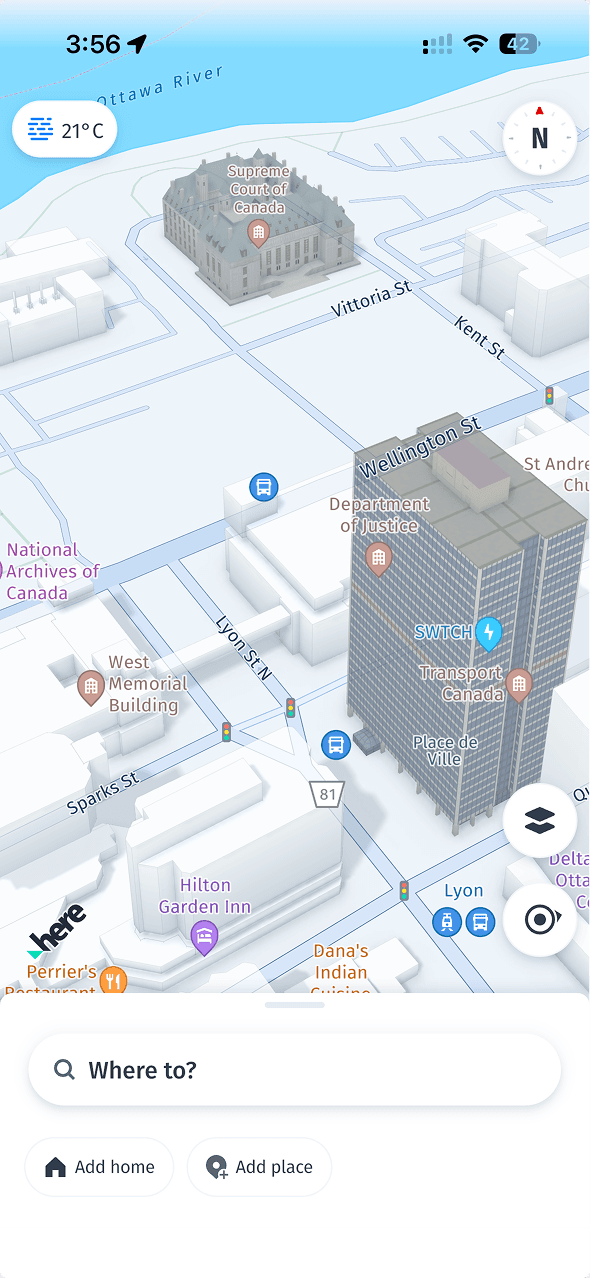
3D mode was added for a specific purpose, complex interchanges. A flat schematic on a multi level interchange does not show which exit is yours, and the driver decides seconds before it. In 3D it is visible.

Search
Search was rebuilt across all platforms together with a business analyst and a lead engineer. We added coordinate search, highlighted the matching part of the query in bold and connected autosuggest. Together this removed the longest step in the scenario: the user no longer scrolled the list to work out which row matched what had been typed.
One principle held all of it together. The same step of a route answers the same question everywhere, in the same order. What changes is the density of delivery, matched to how much attention the user has in that second.
Three teams, one set of decisions
Several teams across five platforms cannot be aligned by instruction. An instruction holds an identical result exactly as long as the person who gave it stays in the room. Once they leave, every team returns to habit, and within six months the product diverges again, now on top of a new brandbook.
So the teams were assembled around a mechanism rather than around a volume of work.
Six designers came on board, and I split them into three teams by platform. Tasks inside each team were assigned by strength. The research line went to the two people who knew it best, the lead designer and the senior designer. I kept the prototype and the design system. These are the two points all three teams pass through: the prototype holds decisions in testable form, the design system holds them identical. If those two lines diverge, everything else does.
The storyboard
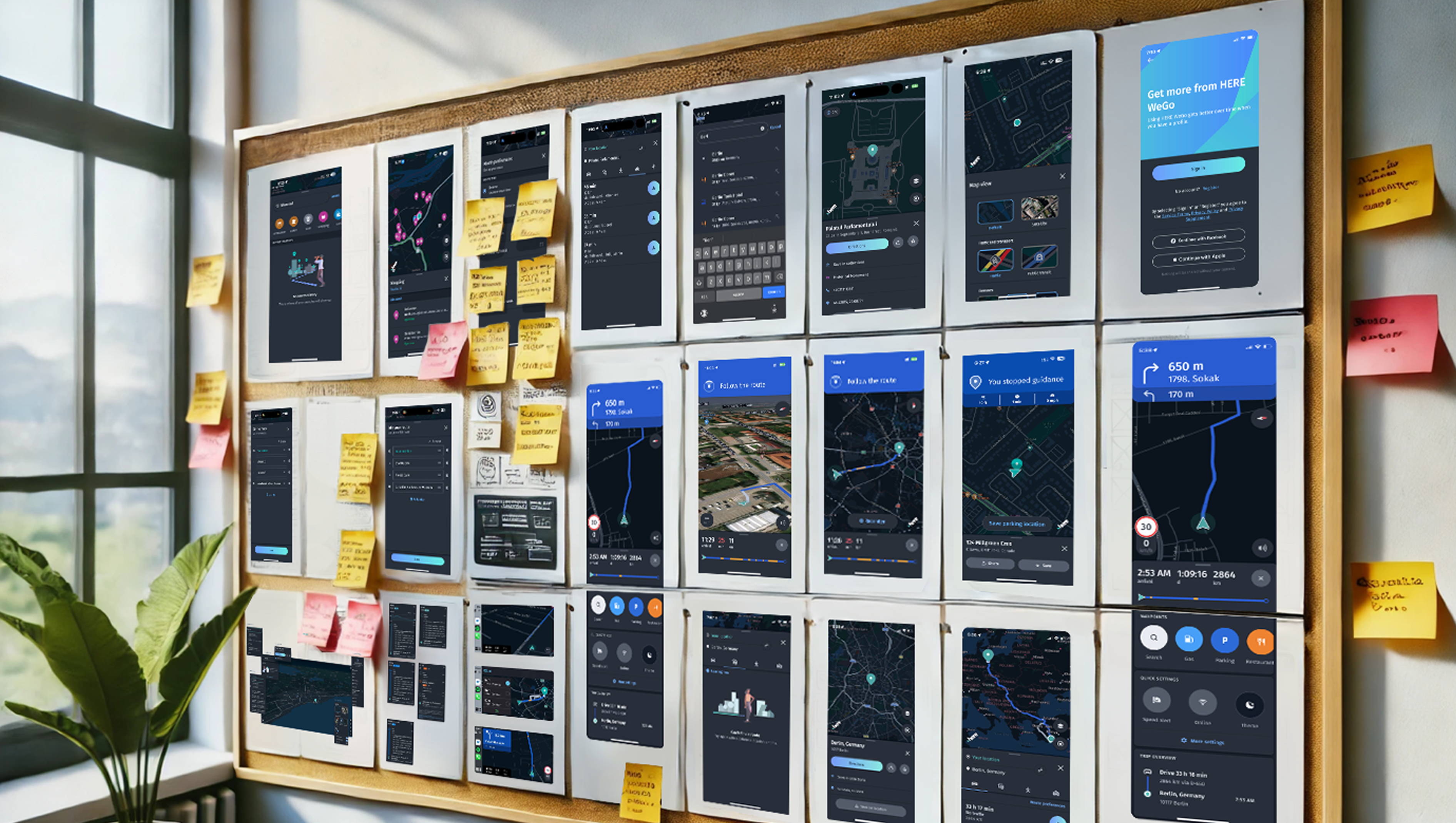
The first thing we built was a storyboard: the key interactions with the product on every platform, laid out on one canvas. It turned out to matter more than planned. The storyboard showed decisions inside a scenario rather than inside a mockup, and it immediately exposed the places where platforms had drifted apart out of sheer inertia. It also closed the main risk of parallel work, because every team saw the whole user journey and weighed its own decision against the neighboring one before drawing anything.
Three mechanisms followed, each solving a specific problem.
Dot Voting
Dot Voting gave speed. Everyone distributes votes across the decisions they consider most consequential, and in ten minutes there is an order where a discussion would eat an hour and end with nothing.
Silent Review and Vote
Silent Review and Vote solved a subtler problem. In a room with a lead and senior designers, the first opinion spoken sets the rest. From there people argue with the person who named the decision instead of with the decision. A silent round removes that: everyone evaluates independently and blind. Afterwards it is visible which decisions are strong on their own and which were held up by the authority of whoever proposed them. The result came out uncomfortable more than once, which is exactly why the mechanism stayed.
The Decision Matrix
The Decision Matrix closed the loop. Every decision that reached the final stage was run against three criteria: impact on user experience, fit with business goals, technical feasibility. The matrix turns an argument about taste into an argument about a criterion. A criterion can be checked.
Together this produced a rule instead of a negotiation. When three teams share one anchor in the storyboard and one way of deciding, an argument about layout closes on the spot and never travels up to a manager. That is what kept the platforms from diverging a second time.
Validation
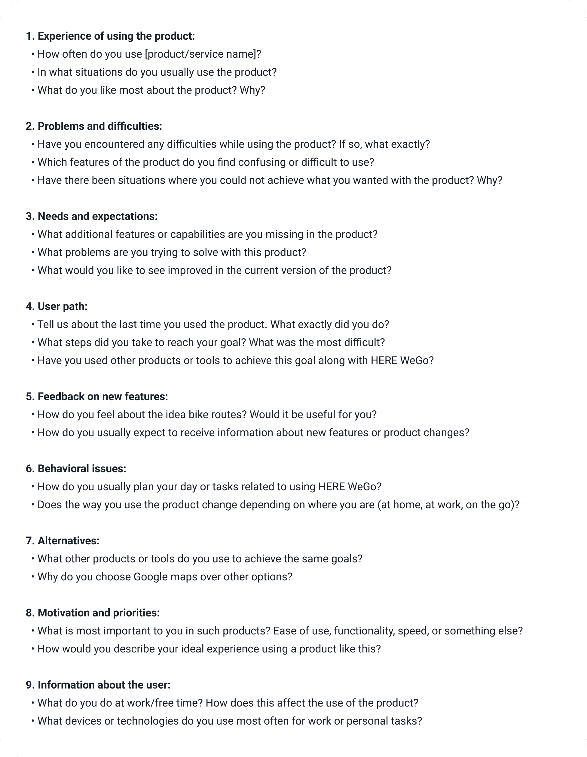
Decisions made for drivers cannot be validated at a desk. A person calmly studying a mockup on a monitor and a person looking at the same screen at speed read it differently. So testing was built around the condition of use.
The scheme was the same throughout. A participant first completed the task on the old interface, then the same task on the new one. That produced a baseline within a single session and a single person, so the difference could not be written off as a difference between groups. Sessions ran with nine to fifteen participants.
Conditions varied by platform. Web and mobile were tested in a lab on real devices and remotely. The automotive interfaces were tested in a driving simulator, where a person drives and uses navigation at the same time. The simulator stood in the HERE Berlin office along with the rest of the equipment, so that part ran on the client's site.
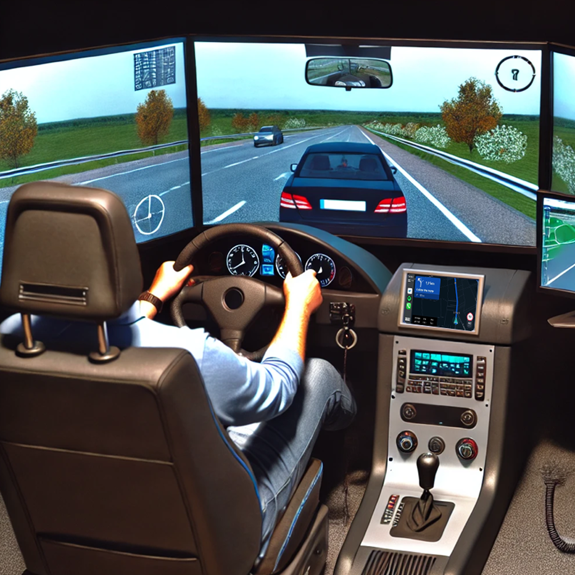
The simulator is what settled several decisions. The speed panel in the lower right corner held up precisely on this evidence: the eye catches it peripherally without leaving the road. The advance warning for the next maneuver was validated the same way, by whether the driver had time to change lanes without a sharp correction at the end.
Testing ran in waves along the roadmap rather than as a single block at the end. Each wave checked what had matured by then, and the result entered the next cycle of decisions before the teams could build another layer on top of it.
Results
All figures below were measured through comparative testing: the same task first on the old interface, then on the new one, with nine to fifteen participants per session.
−31% time to plan a complex route. Task completion time measured before and after.
86% task success rate. Share of participants who completed the task within a set time limit. The limit is the point: in navigation, a task completed too slowly counts as failed on a real trip.
−23% on POI search and route building. Task completion time measured before and after.
+16% NPS and CSAT. Post session participant survey.
Beyond the figures sits the thing the work was started for. Five products were reduced to one set of decisions, and a new step in the product stopped meaning five separate implementations. For Intellias the work meant an expanded order portfolio with its largest client.
Where the credit ends
A few things in this case are worth naming precisely, because in retelling they easily become larger than they were.
I led the HERE Technologies rebrand with a team of three designers.
My formal title was Lead UX/UI Architect at Intellias. HERE Technologies was the client, and all designers worked from the Intellias side. The initiative was approved by Intellias management, and the decisions about the department were made by the HERE WeGo director and the project managers. There was a mandate for the work. There was no line authority over the client's teams. The actual scope of the role ran wider than the title: the client's rebrand, expansion of the order portfolio, forming the design teams, ownership of the prototype and the design system, and the research program.
On MBUX I owned navigation. The feature recognized that year was a different part of the product.
I did not run the research sessions myself. I defined the program, wrote the instructions, assigned the roles, assembled the tooling, arranged the stakeholders and focus groups, and launched the waves along the roadmap. The sessions were run by the lead designer and the senior designer, and my oversight was periodic.
Search optimization was done together with a business analyst and a lead engineer.