Role: design system lead and playing coach (contract title — Senior Designer)
Team: two senior designers and an accessibility designer (mentoring), Storybook engineers, front-end
Period: August 2025 – present
Context: public sector, Salesforce platform, two portals — toronto.ca (browse) and 311 Toronto (transactional, 600+ services)
I was hired to extend the existing Bootstrap system — add components and patterns. The contract title was Senior Designer. This case describes the role I actually performed.
Overview
This case is about one skill: seeing the real scale of a problem when it has been framed too narrowly, and acting on that scale. Here it worked on four levels.
At the product level, the task "extend the system" was reframed into a transition to a managed platform. At the system level, a set of components was made governable: shared acceptance gates, separated governance, accessibility built in. At the technical level, a token architecture removed the development blocker and produced a lean, maintainable set. At the organisational level, a readiness audit diagnosed the process rather than the design, and on that basis the organisation made structural decisions.
Four levels, one way of thinking. That thinking — not any single component — is the spine of this case.
My Role
I owned the design system end to end: strategy, operating model, and production state.
That meant choosing the documentation stack and costing the resources, designing the operating model with governance and a production pipeline, building the token architecture that fed the front-end, and running the readiness audit whose findings reached organisational decisions. In parallel, I mentored two senior designers and an accessibility designer as a playing coach: I led delivery and made the design calls myself.
The contract title was Senior Designer. In practice: design system lead, playing coach, and — when things caught fire — crisis manager.
The Problem
The old system led to a dead end, and extending it would not have helped.
The City of Toronto already had a third-generation design system built on Bootstrap: 4 foundation sections, 8 styles, 37 components, 25 patterns, 7 templates. In substance it was a styleguide — no tokenisation, no governance, patched for years with point fixes against an outdated Bootstrap portal structure.
Assessing the system's state surfaced the core issue: new components would sit on a foundation that no longer carried the load. The problem was not the number of components — it was the scale. What was needed was a managed system with tokenisation, versioning, and governance. Everything after this was built around that conclusion.
Redirect rather than force through
A standalone initiative — "let's rebuild the design system" — would have been a weak argument: expensive, slow, with unclear business value. It would have been cut at the first approval.
The leverage was already there. The dev team had an approved technical migration of the platform from Bootstrap to Salesforce — an engineering initiative from their side. I attached the design system reorganisation to that already-approved transition. The logic was simple: if the old Bootstrap system becomes irrelevant under the new platform anyway, it is sensible to lay down a proper system within the same transition rather than migrate an outdated styleguide. Within a week I prepared and presented the transition plan with its value case.
To make the stack a decision rather than a matter of taste, I compared three documentation architectures — for each one I recorded its role, its primary users, and what the team loses if it is removed. That turned the choice into a dependency map instead of a list of tools. Other people's solutions fed into it too: I studied government design systems — GOV.UK, the U.S. Web Design System, Alberta, British Columbia — how they build structure, governance, and a maintenance cycle, and on that basis assembled a solution specific to Toronto.
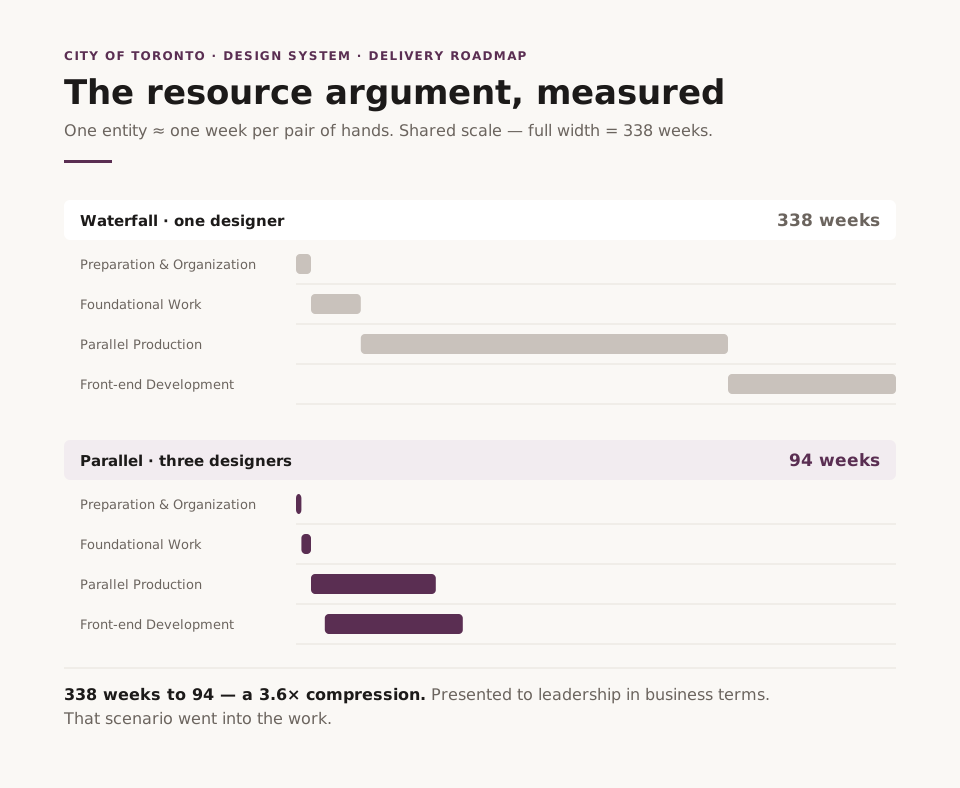
Then came the resource argument, and it rested on measurement. I measured production speed against real entities: one entity — a component with a complete specification across 13 sections — takes roughly one week per pair of hands. From there I built a roadmap across two variables: number of designers, and whether the work runs sequentially or in parallel. The difference was stark: one designer working waterfall — 338 weeks; three working in parallel — 94. I presented that 3.6× to leadership in business terms, and that scenario is the one that went into the work.
One neglected asset fitted in by itself. Storybook had been connected to the old design system years earlier for component testing, but it had fallen into disuse — people no longer knew it existed. Instead of standing up the integration from scratch, I revived what was already there.
Instead of cosmetics over an old styleguide — a full system within an already-approved transition.
A system that can be governed
There were enough components for the old browse portal. But 311 was entering the system's scope — a transactional portal with 600+ services, where people act rather than read — and behind it a chatbot that had gone into development in parallel. The issue was not quantity: what was missing was a shared understanding of when a component is done, who approves changes, and where accessibility lives.
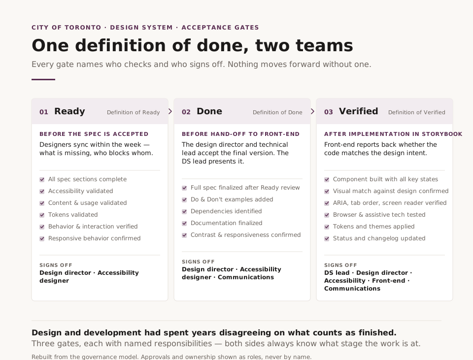
Shared "done". Design and development had spent years disagreeing on what counts as finished — hence endless revision cycles. I introduced three acceptance gates, each with named responsibilities. Ready: designers sync within the week — what is missing, who is blocking whom, how to unblock each other. Done: the design director and the technical lead accept the final version before hand-off to development; I present it. Verified: after testing in Storybook, front-end reports back to designers and leadership on whether the code implementation matches the design intent. Both sides always know what stage the work is at.
Who decides, who executes. These two roles constantly collapse into one another in design systems, and then changes stall. I separated them into four models: who has the final word, how changes are proposed, who owns a domain long-term, and the predetermined path for resolving conflicts. RACI roles were tied to the acceptance gates, not to the structure of the system.
Accessibility inside, not at the end. AODA and WCAG were built directly into the components and into the acceptance gates. Not a separate audit at the end, when reworking is already expensive — a condition without which a component does not move forward.
Underneath sits the frame: six levels from foundations to page templates, and 12 operational domains from strategy to maintenance. Here I also introduced an entire level that did not exist in the system — layouts — building it into the production process alongside the expanded components, patterns, and page templates. The old system held a styleguide; this one holds production.
An unplanned pause
The plan was built around a team of three designers. Tokenisation, under that plan, was mine.
Then two new projects unexpectedly needed reinforcement, so I and one other designer were moved onto them — and on a project sized for three, one specialist remained. Budget to hire additional designers had not been planned for from the outset.
For six months a single pair of hands carried a scope designed for a team. Tokenisation stood still — there was no one to carry it. I was only able to return to the system later.
Tokens as a systemic unblock
Tokenisation was one of the main spines of hand-off from design to development — and it was precisely what had stalled. Without tokens, front-end was blocked. I was brought back to build that layer and hand it over in a way that let the system live without me.
The architecture has three levels: primitive — the raw value; semantic — the role (where and why it is applied); component — the point of application in a component. A component never takes a raw value directly, only through a role. So a single change to a colour or spacing propagates through the whole system automatically instead of being rewritten by hand in dozens of places.
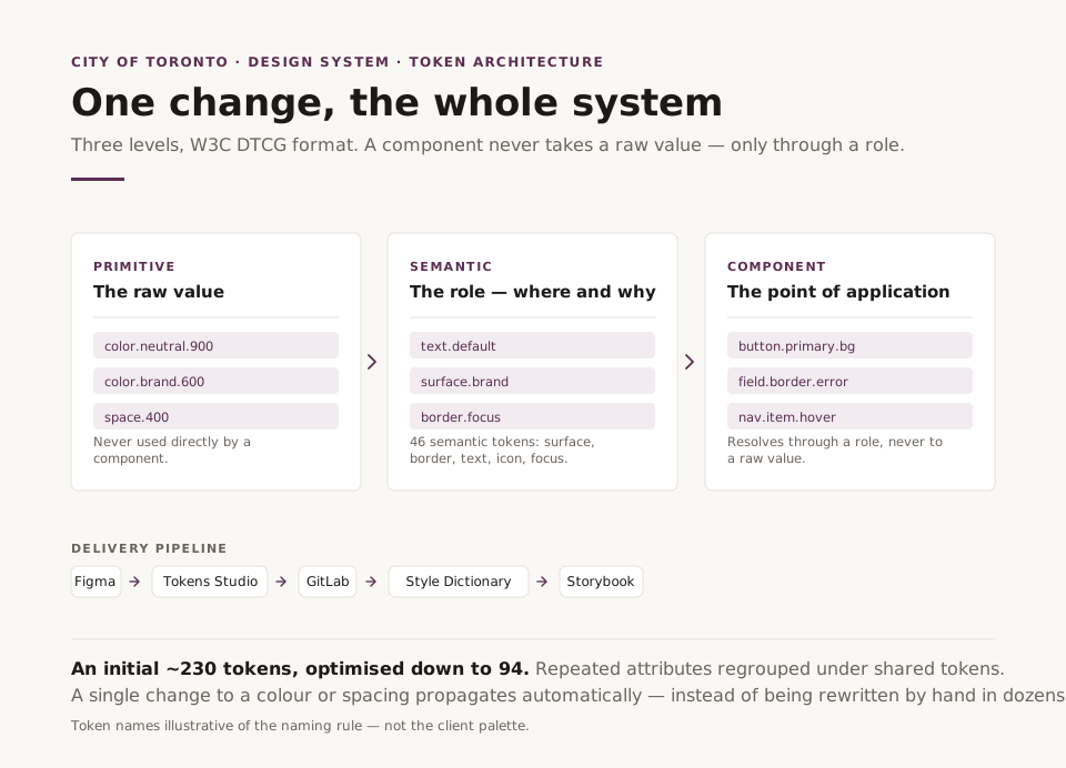
I designed the set to be lean. An initial ~230 tokens I brought down to 94 across several optimisation passes — regrouping repeated attributes under shared tokens.
The palette I solved within constraints. The old system had a palette already approved by Comms, but built against outdated, weaker accessibility standards. Drawing a new one from scratch would have meant breaking what was already agreed. So I kept the colours themselves and strengthened the tone of each against current requirements: 90 of 94 tokens met the standard; the 4 status tokens, where the target contrast is unreachable without changing the colour itself, I handed to the accessibility designer.
But building the layer is half the task. The other half is the specification another designer will run it by: how tokens are created, the naming rules, how to set up Figma and Tokens Studio, how to pass them from design into code via GitLab to Storybook. I wrote that technical documentation in full — from installation to the daily push/pull cycle.
What removed the blocker was not a set of values but an architecture with instructions attached: front-end was unblocked, and another designer has run the tokens without me ever since.
An audit that diagnosed the process
The second task on my return was to work out why the work had stalled and to show the way out. I ran a component readiness audit.
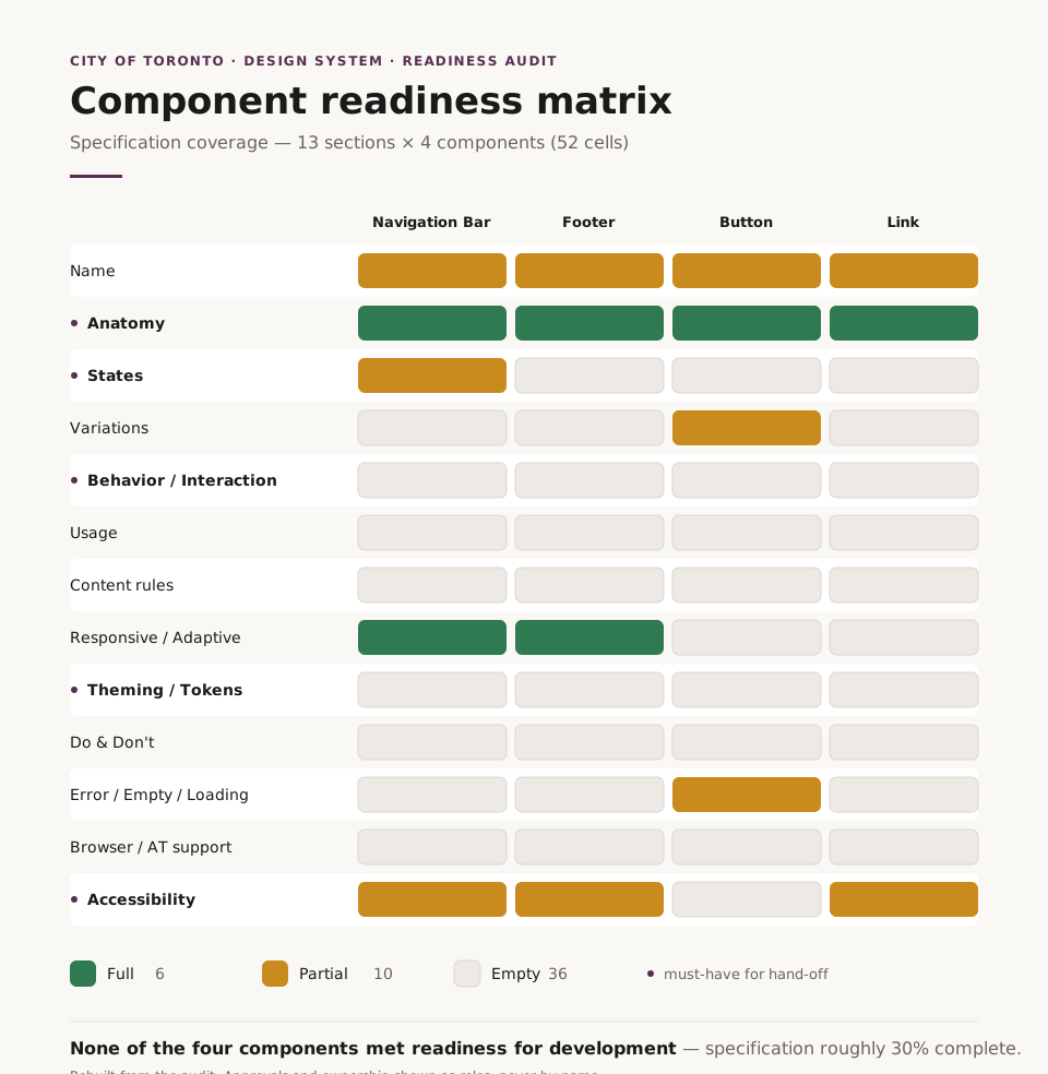
The audit covered five levels at once across both portals, from visual to contextual. The diagnosis was unambiguous: not one of the four components examined met readiness for development. Each one's description should have been filled in across thirteen sections; in fact it stood at roughly 30%. Developers had nothing to tell them how a component should behave — its states, its interaction, its accessibility. In total I recorded 31 specific issues, each in the format "what is wrong, why it matters, what to do".
There was also a structural finding beyond the individual components. The system had been built for one portal — toronto.ca, a browse model. But it now served two. 311 is transactional: the user acts, submits, reports. The same footer or navbar cannot serve "find and read" and "do and send" equally well. I showed how to split these into variants instead of one universal element that serves no one.
The cause was not in the design but in the team's composition: the scope demanded more hands than remained after the transfers, so the acceptance loop could not keep up and components reached development under-specified. I set this out with a week-by-week plan. The audit became the grounds for finding the resource — the organisation decided to strengthen the team with two designers and to introduce an operations management role. After that the project continued to the same standards that had been set at the start.
This is what management-level impact looks like: a diagnosis, a recommendation, an organisational action — regardless of a Senior Designer title.
Result
- The resource argument was built on measurement: one entity ≈ one week per pair of hands, producing roadmap scenarios of 94 versus 338 weeks — and the shorter one went into the work
- The token set was designed lean: an initial ~230 tokens optimised down to 94
- The approved palette was rebuilt against current accessibility standards while keeping the colours: 90 of 94 tokens met the requirements, 4 status tokens handed on for resolution
- A three-level token architecture was built (primitive → semantic → component), together with the Figma → Tokens Studio → GitLab → Storybook pipeline and full technical specification, by which another designer runs the system without me
- Full governance was established — four separate models, RACI, and the Ready / Done / Verified acceptance gates
- The five-level audit showed that all four components examined failed readiness (specification ~30% complete) and exposed structural gaps; as a result the organisation strengthened the team with two designers and introduced an operations management role, and the project continued to its original standards
Reflection
Two lessons. The first is about scale: the most valuable work is sometimes not the work written into the title, but the work you recognise as the real one and take on. The second is about level of impact: when analysis does not stay a document but becomes an organisational decision, that is already the work of a leader rather than an executor. Diagnosing honestly, and framing it so that the organisation acts — that is what separates the two.